Design System MyLeads Portal
As the sole designer on my team, I use Material Design 3’s Figma resources as a foundation for a unified look, ensuring brand consistency and quality.
I customize styles, components, and tokens to align with our brand and product needs.
This approach helps me move faster, maintain consistency, and create a unique design without reinventing the wheel.


Let’s start from Typography…
We need standard typography to help us establish hierarchy within a design by indicating the relative importance of different elements
➡️ For accessibility, we've used a base text size of 16 pixels, aligning with our commitment to inclusive design and meeting our users' needs
This ensures that users, ranging from 25 to 65+, can effortlessly engage with our content

Color Palette

Colors evoke emotional responses and can influence users' perceptions and behavior.
As a technical solutions company, we build software and provide services for users. Our primary color, electric blue, symbolizes confidence and trust, aligning with our commitment to reliability
⬇️ In the new version logo, we maintain consistency by implementing a flat style icon with a modern look
Grid System and Spacing
We use a 14-column grid, which provides greater flexibility in creating varied and complex layouts
Grid systems and spacing are used for creating responsive designs, and flexible grid structures ensure that content scales appropriately and maintains visual hierarchy across various breakpoints

Icons


Icon Outlined
Used for secondary actions, help establish a clear visual hierarchy by indicating less emphasis
Default or inactive states, an outlined email icon indicates that an email can be sent
VS
Icon Filled
Used for primary actions, filled icons draw more attention and indicate a more direct action
Representing selected states, a filled email icon indicates an email has been sent
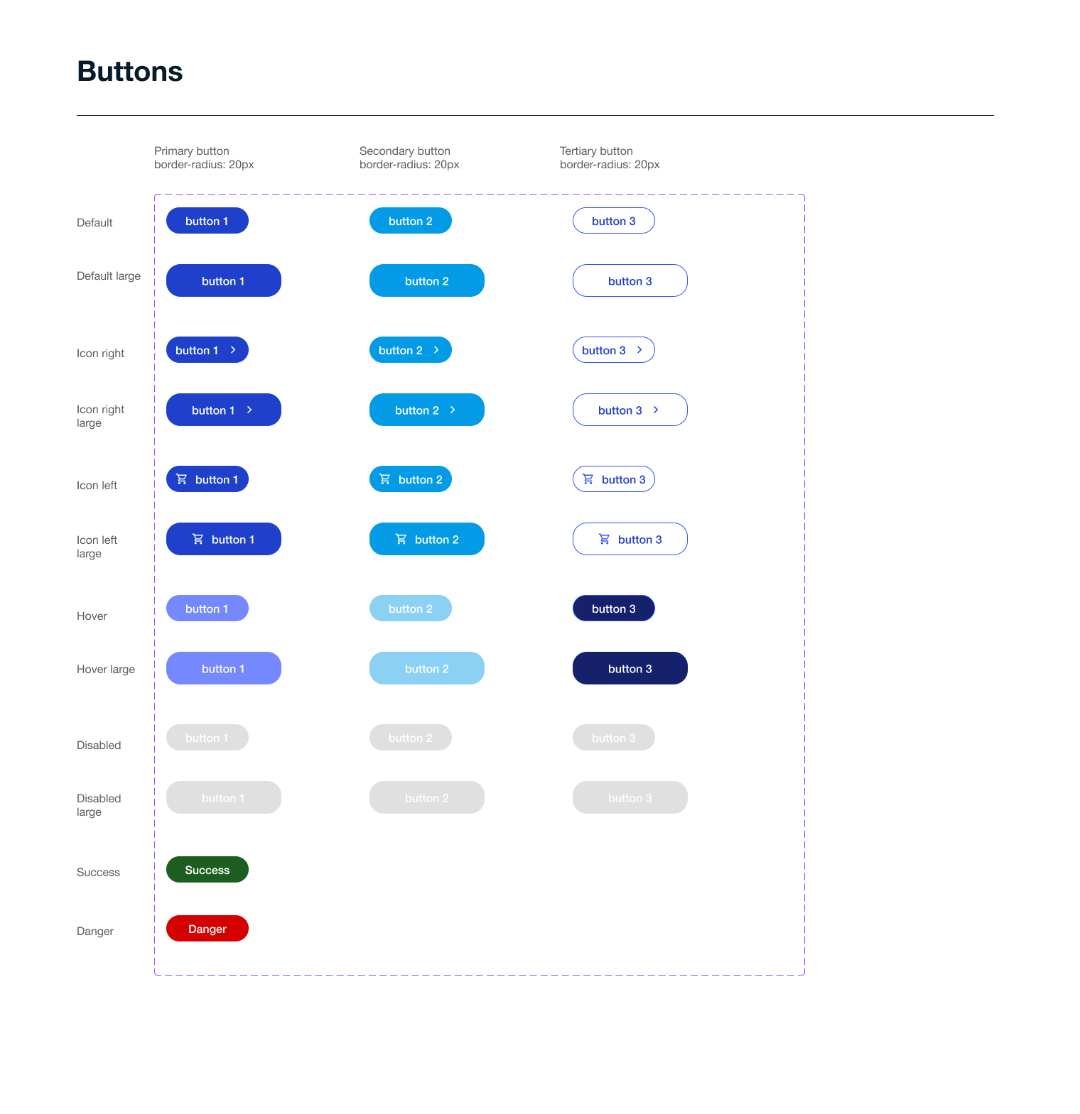
Buttons
Buttons are the main calls to action (CTAs) in a website, guiding users to key actions like order check out or submit a form
We ensure consistency, usability, and brand identity while providing clear interaction feedback
Textfield
Text fields include built-in validation to ensure correct data entry. Error messages provide immediate feedback if the input is invalid, preventing user errors and frustration.

Tabs


To ensure consistency for the tabs, Material Design 3 guidelines for tab components have been implemented in the Leads Portal
Design System Experience
My Contribution to the design system (components, guidelines, documentation)
Created new reusable components like a dynamic form builder and a responsive card layout.
Collaborated closely with developers to ensure accessibility compliance (WCAG 2.1) and ease of implementation.
Updated typography and color usage documentation following a brand refresh.
Documented component behavior, edge cases, and usage examples in Figma.
Made it easier for developers to adopt and maintain design system elements.
How to keep consistency across products?
Design within a shared design system library in Figma using pre-approved components and styles.
Coordinate with cross functional team in weekly design reviews for alignment on interaction patterns and visual style.
Conduct regular UI audits to identify deviations from the design system.
Provide feedback to maintain consistency in typography, color, and spacing.
How to balance innovation with system constraints?
View system constraints as a starting point, not a limitation.
When the system lacked a suitable stepper component for onboarding, I proposed a variation using existing tokens and spacing rules.
Tested the new component with users to validate its effectiveness.
After validation, added the component to the design system for reuse across products.


Accessibility:
Follow WCAG guidelines to ensure designs are usable by people with disabilities.
Use semantic HTML, sufficient color contrast, and keyboard navigation support.
Visual Hierarchy:
Apply size, color, spacing, and typography to guide user attention effectively.
Prioritize content based on user needs and goals.
Staying Updated:
Follow industry blogs like Nielsen Norman Group.
Attend design conferences and webinars.
Participate in online communities such as UX Slack groups.
Responsive Design:
Design flexible layouts that adapt smoothly across devices and screen sizes.
Use fluid grids, media queries, and scalable components.
Performance Considerations:
Optimize images and assets for faster load times.
Minimize unnecessary animations and heavy elements.
Next Step
My next step is to implement Material Design 3 across all our digital products during the redesign. As a sole designer, maintaining an effective system is challenging, but prioritizing accessibility and usability is crucial. Material Design 3 continuously evolves based on user feedback and technological advancements, making it a good starting point for our redesign efforts