Problem
How might we streamline order management to be more efficient, while encouraging exhibitors to order more products with easy navigation?
Solution
We aim to redesign the Leads Portal page and integrate the Order Management system to streamline workflows and maintain consistency
My RoleProduct Designer
Project TimeJan 2024 - Present
ToolsFigma
My Contribution Collaborated with two developers and a marketing director, serving as the sole designer on the team. (Team of 4)
Focused on user experience and gathered valuable insights through user feedback.
Conducted user testing with three team members to collect and incorporate valuable input.
Redesigned the UI of the lead portal to align with material design guidelines.

Lead Ordering System vs. Lead Retrieval Portal
➡️ Lead Ordering System: A platform where exhibitors purchase products to collect lead data, such as scanners, app licenses, and API access.
➡️ Lead Retrieval Portal: A system where exhibitors access and manage the lead data collected using those tools.
In short, the Lead Ordering System is for acquiring the necessary tools, while the Lead Retrieval Portal is for using and managing the collected leads.
Lead Ordering System ➡️
Lead Retrieval Portal ➡️
Overview of the Lead Retrieval Portal
What is the Lead Retrieval Portal?
➡️ The lead portal tracks prospects analyzes ROI, and provides real-time access for follow-up ☑️
Who uses the Lead Retrieval Portal?
➡️ Exhibitors seeking to expand their business at trade shows and conferences, and to network and partner with industry players
Why do we need the Lead Portal?
➡️ Exhibitors collect and manage sales leads from trade shows
➡️ Exhibitors utilize a mobile app or API for data collection
⬆️ The Event Overview page summarizes data for each event, including total companies, devices used, reports, emails, and orders. 
Sitemap
To understand the Lead Retrieval Portal, I created a sitemap to determine where to integrate the ordering feature. Due to layers of 'states' and 'roles' in the portal, having a sitemap gives me a clear information structure of where the feature should be placed.
Add the add more products feature here name it "Add Devices."
⬆️ We want our clients (the exhibitors) to purchase more products while managing their lead data, so we decided to place the "Add More Products" feature in the Devices section and name it "Add Devices."

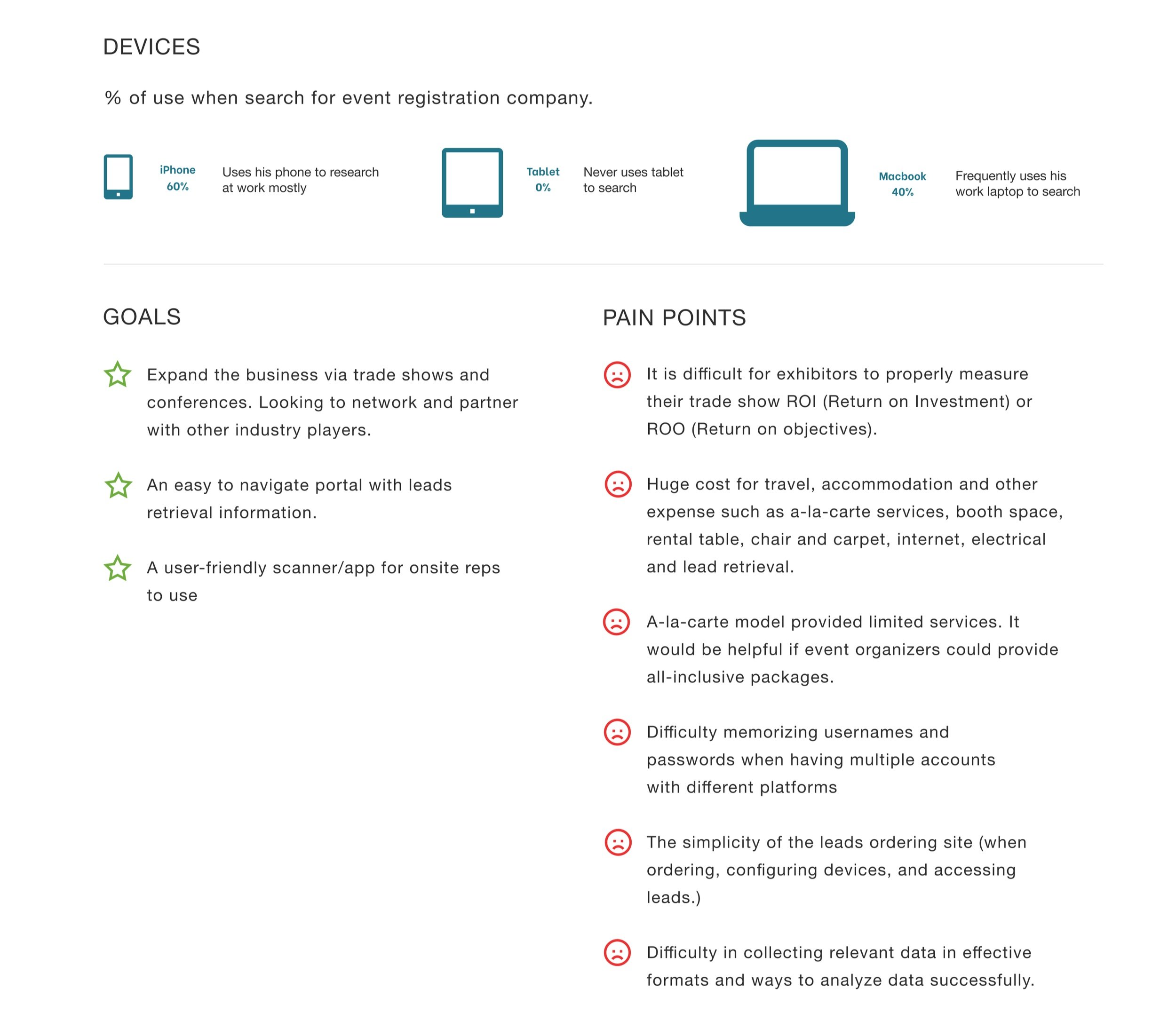
User Persona

User Problems
As an exhibitor, having to switch to the ordering system decreases my willingness to order because it requires navigating to a different platform
As an employee, switching between assisting clients with product orders and connecting them to the leads portal slows down my workflow
Key pain points from users problems:
▪️ Complex navigation between platforms
▪️ Hindered promotion and sales
▪️ Workflow slowdown
➡️ Based on the pain points mentioned above, we decided to formulate 2 hypotheses to address the problems
Explorations
Hypothesis 1
By focusing on the product,
1) Clear navigation for employees and exhibitors (go to the product page to place an order)
2) Promotion and sales can be listed on the product page
3) Categorizing all products on a product page may save time but may not reduce workload

Hypothesis 2
By prioritizing user experience,
1) Users are more likely to order products while reviewing the current selection
2) Promotion and sales can be listed on the product pop-up page
3) Remove redundant steps and streamline the connection between the Lead Ordering System and Lead Retrieval Portal. This not only reduces workload but also improves workflow
User Testing
➡️ I invited four employees and four exhibitors to participate in testing our hypotheses to improving the user experience, as the result…
❌ Hypothesis 1 Add a 'Products' tab to the menu, and have a product page displaying all items
❌ This hypothesis was not selected as the existing lead order page fulfills the same function, rendering the additional system redundant
Hypothesis 2Add the ordering feature to the devices section as a pop-up
⭕️ This hypothesis was selected

Design Outcome UI
MyLeads Portal - Before
⬇️ On the company page, there is a licenses tab where you can view details of licenses, but there is no place to add new licenses.

MyLeads Portal - 🚩After
🚩Step 1
The Devices page is on the company overview page; instead of having a tab, it has its own separate page
Clear call-to-action (CTA) buttons are located on the top right, ensuring users can easily see them
🚩Step 2:
The 'Add Order' button allows users to purchase devices conveniently while reviewing the current product.
🚩Step 3
Ensure a consistent design with the lead order system, allowing users to choose quantity, and price options, and select 'Check Out’
🚩Step 4
Simplifying the product and payment summary with clear steps will increase workload efficiency
Project Metrics& Goals
🤩 Users' positive feedback
➡️ Receive positive feedback from exhibitors and employees regarding the seamless order placement experience and easy navigation
📈 Increase sales numbers
➡️ Expect to see an increase of 30% in sales for featured products
👨🏻💻 Reduce employees' workload
➡️ Increase efficiency and gather employee feedback on sales, customer responses, and performance for evaluation

Next Step
✅ Understanding what users need helped us find a good solution but deciding whether to add an order system to the portal or use a pop-up was tough, we had to also consider the technical perspective.
✅ Planning everything carefully is essential, just like figuring out what success looks like and making iterations based on what we think will happen before we start.
Next: Transit App Project ➡️


